I often set myself little challenges to come up with a method that solves a problem or improves something (usually somehow related to something at work, or something from the GLAM sector). It will usually involve some technique, or programming feature that I’m trying to learn. Practical learning. In this case, I was looking at dynamically generating SVG files for some visualisation work and it took me on a bit of an unexpected journey. I thought I would talk through where this ended up – exploring the relevancy ranking of result zones in Trove and resulting in my Trove bubbles.
Some background to where this came from
When you go to Amazon and undertake a search, like most sites these days, you start to get autocomplete suggestions as you type. In this example below, when I search for headphones, there’s some clever mathematics going on behind the scenes that along with suggesting product titles for my term, it suggests the most relevant subject areas that relate to my term. In this case there’s higher relevance for headphones in Electronics than in Cell phones & accessories (or maybe a clothing option where there might be prints of headphones on a T-shirt).

This search suggestion serves exactly the same purpose as a traditional website structure in trying to deliver the user to the right area of content on the site as quickly and easily as possible.
In Trove terms, lets relate these back to zones. When we undertake a search, we get presented with results for each zone and are given a number of results for each zone. What we aren’t given is how relevant each of these zones are. Each zone is presented with the same level of importance as every other zone regardless of the search term. As a designer, how can I change this so that I could present the most relevant zone for a search term to the user and potentially structure the page differently to do so & hopefully lead the user in the right direction?
Let me walk through a little experiment that shows how I might come to a solution to this problem.
When querying Trove through the API, one of the responses that is returned for each record in a result is a relevance score.
...
relevance: {
  score: "8.01584",
  value: "very relevant"
},
...
In the most simplest terms we could plot this relevancy score for the top results in each zone (by default this is 20 results per zone) on a chart to easily compare the difference between various search terms.
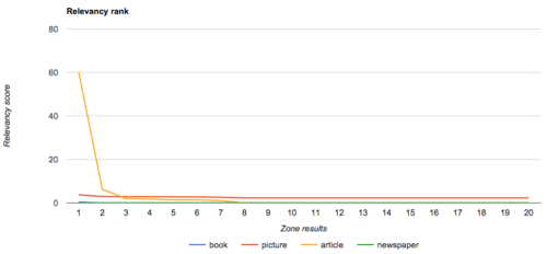
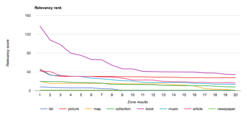
It becomes obvious that different searches deliver very different types of content as their top results. We’re starting to get an indicator as to what might be the most relevant zone for a query.
If we look at the chart above for the search on my name – what would the most relevant zone be? Would it be the archive zone that has 1 very relevant result and then very little or the picture zone that isn’t quite as highly ranked in relevance, but has a lot more content that appears relevant?
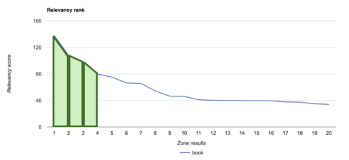
We could look at the basic statistical types of measures such as averages, means, standard deviations to come up with a figure. For my purposes, I’m going to stay with the chart I’ve generated and measure the area under the line to make my determination. This can easily be measured by calculating the area of a trapezoid for each result as it’s plotted and adding these together: (x + y)/2 * w
So we could use the following formula to calculate the area under the line (assuming the width of each trapezoid is 1):
(result 1 relevance score +Â result 2 relevance score)/2 + (result 2 relevance score +Â result 3 relevance score)/2 + (result 3 relevance score +Â result 4 relevance score)/2 + ...
and so on until we get to result 20.
If we return to the search for “Paul Hagon” we get results for areas of:
- picture: 47.425
- article: 44.195
We now have an answer that for this search, the most relevant result for this search is pictures, the zone with less relevant but more results, compared with the articles zone that has one highly relevant result and not a lot of other relevant results.
We could tailor the display of results to provide an emphasis on pictures and deliver the most relevant result.
 Moving beyond the maths
We live in an age of visualisations and so in addition to tailoring the display in a certain manner, we can expose these calculations to a visitor without bombarding them with the maths behind the result.
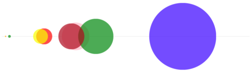
I love the UTS ribbon, that lives of on the catalogue of the library at UTS. This is a rainbow of dewey classifications for a result. It enhances your search results without taking away from the results themselves.

Could something similar be used to enhance the zones for Trove? We’ve already done all the maths for each item in the results – we know the averages of relevancy scores, the area under a graph, the standard deviation. Let’s combine some of this and turn it into something interesting. This is where my initial purpose of generating some dynamic SVG’s to visualise something came to life.
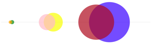
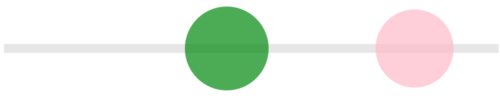
By plotting the average relevance of the zone on the x-axis and making the area of the bubble the same as the area under the line chart, we can create a simple little visualisation of the zone relevance breakdown. This provides a user with an indication of which zones are likely to provide the most relevant results for their search term. You can click through a range of sample searches below to see all the details about the search term & click on a bubble.

Summary
So that is my Trove bubbles. From starting off looking at how to generate some SVG files, this lead to looking for something to visualise, which in turn lead to looking at Trove zone results. Sometimes it’s a very strange path that you take to learn something, but in the end, it’s not necessarily about the end result, it’s about the journey. The random discoveries you make along the way can be really fascinating.
Comments
One response to “Trove zone relevancy bubbles”
After reading your posts I always feel a little bit smarter. Thanks for the background here.
I also agree that serendipity journeys can be more helpful for our future development that we initially think at the time.